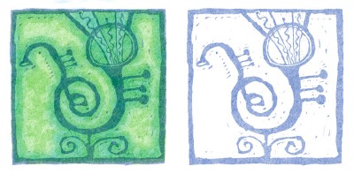
 This image is a preliminary experiment for the A-line series I did for a faculty art show last fall. I have always liked it and felt that it was a good match for this weeks Illustration Friday.
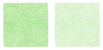
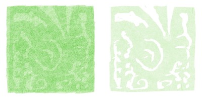
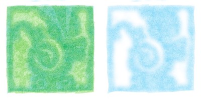
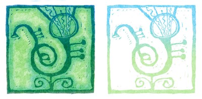
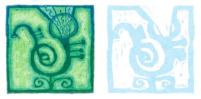
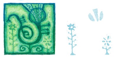
In photoshop, I use a layer for each color. I am using the multiply mode on each layer so that the colors look like they have been overprinted. I added a slightly different texture to each layer so that the color would build up in a more natural way. I started each layer with a solid block of color and then used the eraser tool with a hard edge brush to remove the area that I didn’t want to print. It makes it feel like a woodblock print.
Layer 1 is a white background layer.
5 Comments
Comments are closed.

I love seeing how the layers work… sadly for some reason I’m still having trouble envisioning the way you think!
Did you have an original drawing?
Wow this is fantastic!!!
Waw!!! Amazing!
very cool process – great piece of art
Wow! I’ve always loved seeing your fantastic design skills! This is super fun and I love the attention to details!