![]()
This pattern sits within an ongoing project to develop a body of repeat designs grounded in daily observation and practical constraint. Not every day produces a finished design, but each contributes decisions, tests, and corrections that shape the final work. Oak Ribbon Stripe is the result of one of those consolidation days—less about discovery, more about distillation.
Country Retro: a working definition
For this project, country retro is not a decorative theme or a nostalgic style. It refers instead to a specific visual behavior common to mid-century rural American textiles and wallpapers—objects designed for everyday use, produced with limited means, and expected to wear.
Country retro patterns tend to share a few characteristics:
- Motifs are ordinary rather than symbolic.
- Structure leads; imagery follows.
- Repeats are predictable, but not precious.
- Variation comes from production tolerance, not from expressive drawing.
These patterns were not trying to communicate personality or sentiment. They were meant to live quietly in kitchens, hallways, and utility spaces, holding up under repeated use. That utilitarian mindset—not a romantic one—is what I treat as the core of the category.
Starting point: structure before motif
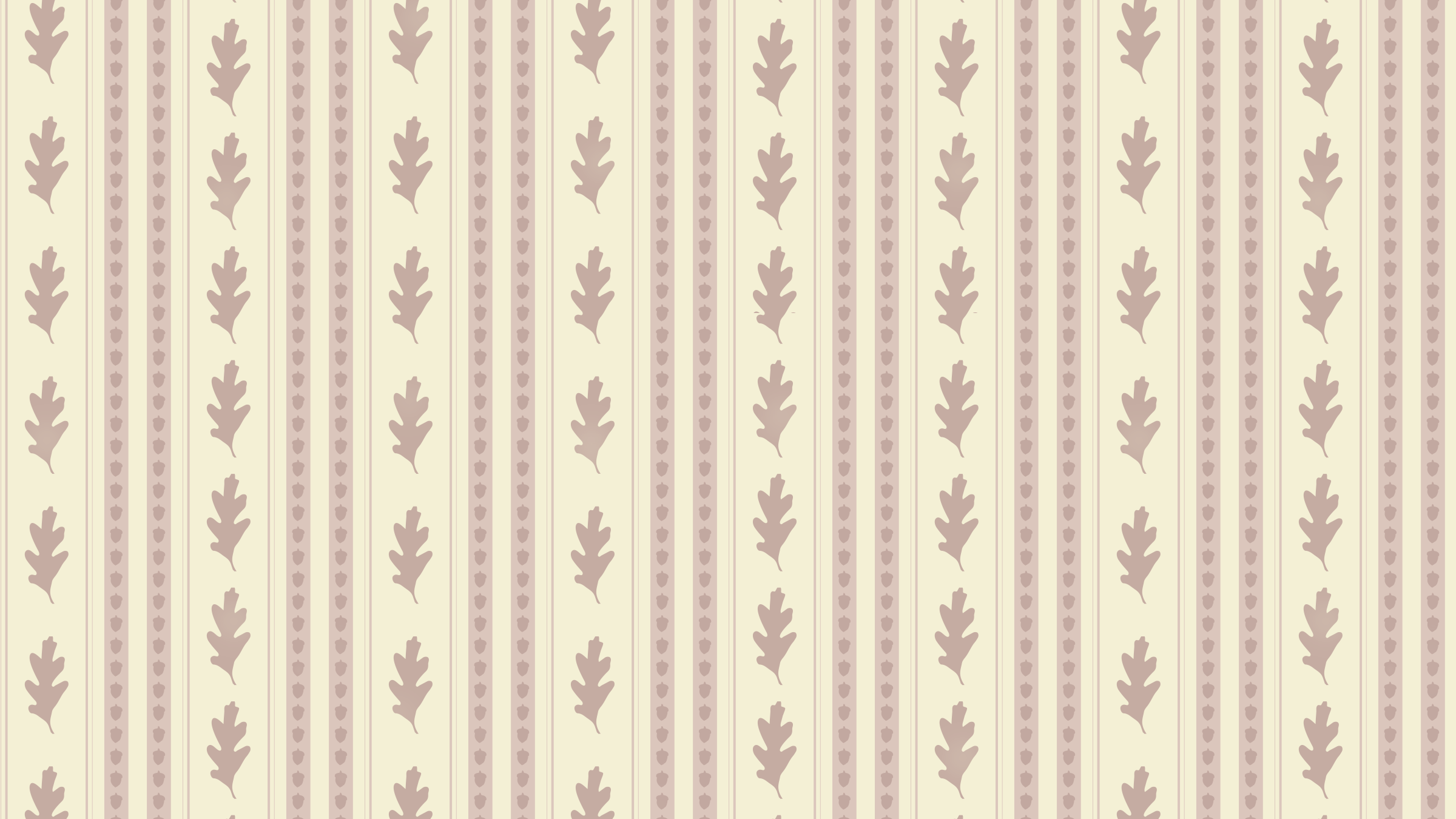
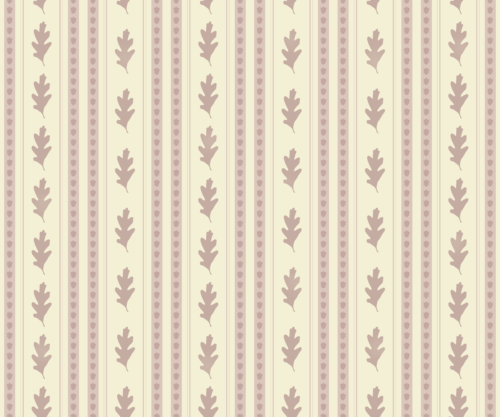
This design began without a walk or a new artifact. Instead, it grew out of existing material—oak leaves and acorns previously drawn from observation—and a need to produce a simple, legible pattern quickly without defaulting to generic florals.
Rather than asking what the motif should be, I started with structure. Vertical ribbon stripes were appearing consistently in Spoonflower’s promoted products, and historically they function well in interiors: they scale easily, read clearly at distance, and tolerate repetition.
The decision was made early to prioritize printed columns over decorative stripes. Each vertical band would behave like a single print plate, repeated across the width, rather than like an illustrated stripe with internal variation.
Motif reduction and containment
Oak leaves and acorns were chosen not for symbolism, but for their ordinariness. They are regional, familiar, and visually resilient. To keep them from becoming decorative or seasonal, they were reduced to blunt, repeatable shapes:
- One leaf size, one orientation
- No rotation or mirroring
- No complete silhouettes framed as motifs
The leaves were arranged in continuous vertical chains that float within the repeat rather than touching its edges. This prevents the motif from resolving too neatly and keeps attention on the stripe system itself.
Acorns were initially smaller, functioning almost as punctuation. During testing, they were enlarged slightly so they could hold their columns with more confidence while still remaining secondary to the leaves.
Brick logic and restraint
Early versions introduced variation through differing leaf counts between columns. While this successfully broke vertical lockstep, it also introduced a level of irregularity that felt noticeable at room scale. The final version normalizes leaf spacing across columns, relying instead on surface behavior—rather than structural difference—to introduce life.
This was an important decision point. In country retro patterns, not every kind of variation is useful. Structural inconsistency reads as design intent; surface inconsistency reads as production reality. For this pattern, calm won out over cleverness.
Ink behavior, not texture
All motifs were drawn as clean vector shapes. Softness was introduced later through controlled masking to simulate pressure inconsistency rather than through brush marks or added texture.
This distinction matters. Historically, many utilitarian prints were made with blocks, plates, or screens—processes that produce hard shapes with imperfect transfer. Ink fails at edges, density shifts locally, and some impressions print lighter than others.
To reflect that:
- Leaves received the most pressure variation
- Acorns echoed that variation more lightly
- Stripes remained the most stable element
All variation was applied sparingly and unevenly, with most impressions left untouched. The goal was to reduce authority slightly, not to add visible character.
Color and hierarchy
A buttermilk ground was chosen to act as a quiet field rather than a feature color. Leaves and acorns share a muted clay-toned ink, reinforcing their relationship as part of the same print family. The stripes use a closely related value shift, allowing them to read first without overpowering the motifs.
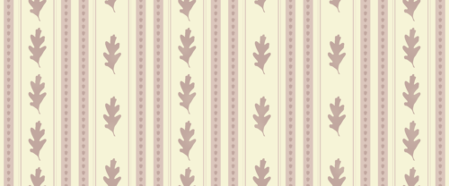
At room distance, the pattern reads as striped wallpaper. The oak elements appear on a second look. This hierarchy was intentional.
Pattern in use
Seeing Oak Ribbon Stripe applied at room scale was an important confirmation step. Vertical stripe patterns behave differently once they leave the screen and enter real architectural conditions—corners, stairwells, wainscoting, furniture edges.
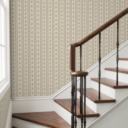
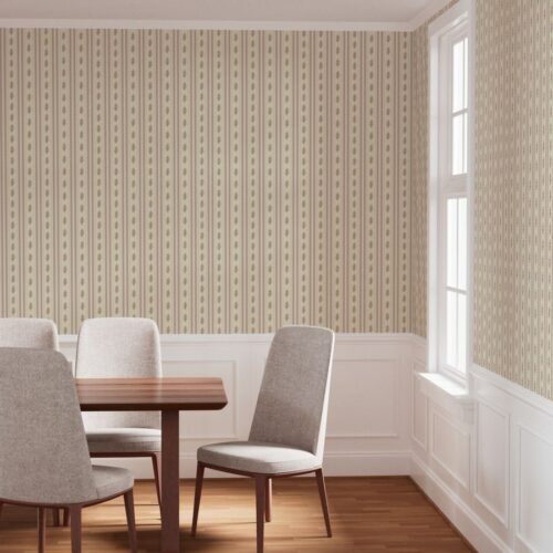
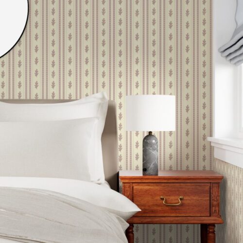
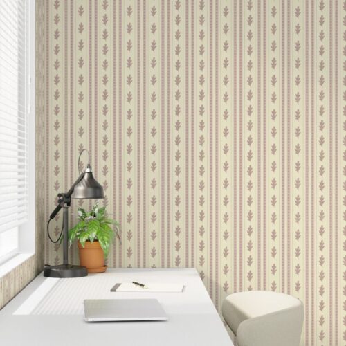
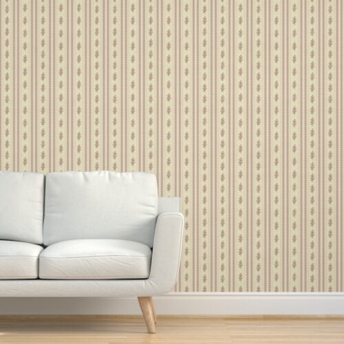
To test this, I reviewed Spoonflower’s wallpaper mockups across several typical interior scenarios: a stair landing, dining room, bedroom, workspace, and living area. In each case, the pattern reads as structure first. The stripes establish rhythm and scale, while the oak leaves and acorns remain secondary, only registering as you move closer to the wall.
This is the behavior I was aiming for. The pattern holds long views without visual fatigue and tolerates partial coverage, trim interruptions, and changing light conditions.
The wallpaper version shown here is available directly through Spoonflower:
Oak Leaf Stripe Wallpaper – Country Farmhouse Vertical Stripe
https://www.spoonflower.com/en/wallpaper/21232605
Final considerations
The final repeat size—24 × 20 inches—allows the vertical rhythm to breathe while keeping the pattern calm across a full wall. In mockups, the repeat disappears, which is exactly what this design is meant to do.
Oak Ribbon Stripe fits within the country retro category not because of its imagery, but because of its behavior. It privileges structure over motif, accepts minor imperfection, and resists the urge to decorate. It is meant to be lived with rather than noticed.
Studio Notes / Metadata
- Project: 100 Patterns — Southern Alabama
- Pattern Name: Oak Ribbon Stripe
- Location: Studio day (no walk)
- Artifact: Oak leaves and acorns (previously observed)
- Focus: Structure-first country retro stripe
- Status: Finished, competition submission